|
Making Home PossibleTell your site visitors exactly who you are
|
Overview
|
Freddie Mac impacts everyone who lives in a residence across America. They provide liquidity, stability and affordability to the nation's housing market. Freddie Mac makes home possible for one in four home buyers and is one of the largest sources of financing for multifamily housing.
The Freddie Mac home ownership site in the past has been geared for users who needed help during the housing crisis. As people went through foreclosures, Freddie Mac was tasked with helping people understand their options. Since the market has started to shift towards purchasing again, Freddie Mac wanted to change their site to speak to a wider audience. |
Responsibilities:
Role: UX Lead Activities:
|
The Challenge |
Through several stakeholder interviews we learned the objectives of the the redesign - to reimagine Freddie Mac’s digital strategy to better support the organization’s commitment to helping people own or rent a home, stabilize communities, and shape a strong housing finance system for the future. To support their goal, it was important to deliver concepts that align the “About Homeownership” section more tightly with the needs of a wide variety of audience segments, looking for clear and unbiased guidance around the complex questions of housing.
|
The Approach
Learn the Process,
|
Understanding the process of buying, renting, selling and foreclosures helped us better understand users' thought processes, their emotions and the types of things they needed to know while going through steps of a given process. By understanding where frustrations lie along those processes we were able to find out where Freddie Mac could help provide information to consumers.
|
Build Trust |
We formed a solid relationship with the client by talking through the various stages of the product and welcoming them into each part of the process.
|
Dig into Literature |
Several sources helped us understand the mindset of an individual buying, selling or renting a home as well as millennial attitudes and motivations which were imperative to creating the site.
|
The Vision |
Create a holistic user experience that allows consumers to find Freddie Mac, find relevant content, engage with Freddie Mac and endorse them by integrating marketing, content, social and user experience strategies to achieve their goals.
|
Follow the ProcessWhile other sites were focused on solely providing topical information, we wanted to create a site that focused on helping users understand what to expect during each process. We also wanted to provide those who were looking for topical information an avenue to find information they needed.
|
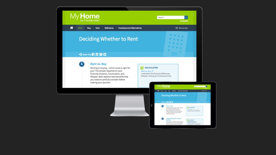
Mobile FirstBecause the phone played a major part in how users did research with respect to housing, we wanted to make sure that this information was mobile friendly. We decided to go with a mobile first approach to ensure that the phone version of the site worked well for its users.
|
User Experience Design
Content Strategy |
Because housing is such a complex subject it was important to really focus on the content. We wanted to ensure people knew where to start and that information was easy to understand and share. Based on the need for social sharing to help build a brand in this space, it was important to explore ways to better disseminate content outside of their platform and ensure content was authored for portability.
|
Navigation
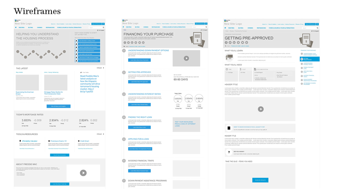
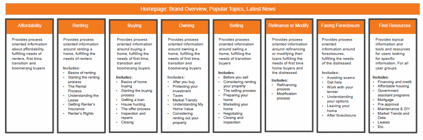
Because we found that users didn't know what to expect during each of the processes, renting, buying, owning, selling, refinancing and foreclosure, we choose a navigation that conveyed those processes. We wanted to help users understand and better prepare for the different aspects of each. We also included a "topics and resources" menu to help users who have a specific topic in mind (e.g., PMI). In addition to the main navigation, we wanted to expose frequently used (checked through analytics) and highly necessary tools in the utility navigation.
Layout and Interaction
We wanted to provide a modular system that allows the business to easily place content throughout the site and make it easy for components to stack as users viewed information on different view ports. We used a step/checklist design pattern to visually represent the different steps users may take throughout the process. On landing pages, we wanted to pull up interesting pieces of content to increase engagement and interest at the landing page level. We used pinned navigation to help users quickly and easily access information throughout the site. We included hover and touch states so users understood which items were clickable.