Overview
|
Cigna-HealthSpring is a health services company committed to helping our nation's Medicare and Medicaid beneficiaries live healthier, more active lives through personalized, affordable and easy-to-use health care solutions.
My Role I was the experience lead on the project where I managed 2 visual designers and 2 UX designers on the project. I was responsible for the experience design of the solution and the quality of all experience deliverables. I ensured consistency in design, proper use of the design system, setting up, running and analyzing user research, leading stakeholder workshops and prioritizing features to determine MVP. The project lasted 12 weeks. |
Project Needs:
User Experience Design Role: Experience Lead Activities:
|
The Challenge
Cigna for Seniors wanted to design an experience that made their customers stay with them through the duration of their Medicare needs. Cigna however, did not have much of an online presence for its members and the one that was available lacked value-added services.
The Approach
Stakeholder interviews and Alignment Sessions
We worked with stakeholders across Cigna to better understand who their users were and any assumptions/research they had about their users . It was important to also come to an agreement on the goals and KPIs important to the business. We also worked to understand directionally where the business was headed. I led the design of the interview framework and workshop guides. We also wanted to better understand their competition and where they were ahead or behind in comparison.
Understanding the Industry
We wanted to understand the healthcare industry as a whole and what types of issues people and the industry faces.
Data Collection and Analysis
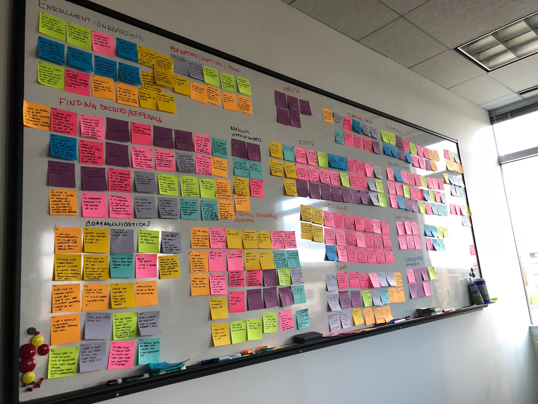
We tried to work with the analytics teams and call center teams at Cigna but they did not have coded data from the call center and their analytics had not been setup in a way that we could draw insights. Instead we talked directly to call center agents to learn more about what they thought the big issues were. We also viewed a lot of market research that helped us determine what features and services make people purchase from their Medicare provider as well as leave their Medicare provider. We also received key metrics on technology use among customers and non customers. All this information was used with the user interviews to craft a strategy around the experience we needed to provide.
Competitive Analysis
While we were able to view some Medicare websites we didn’t have access to Medicare portals available to members. We did however, look at tours available on websites and read about the various features available to Medicare members. This provided us the ability to determine where the client needs improvement and what new features help leapfrog them above their competition.
Contextual Customer Interviews
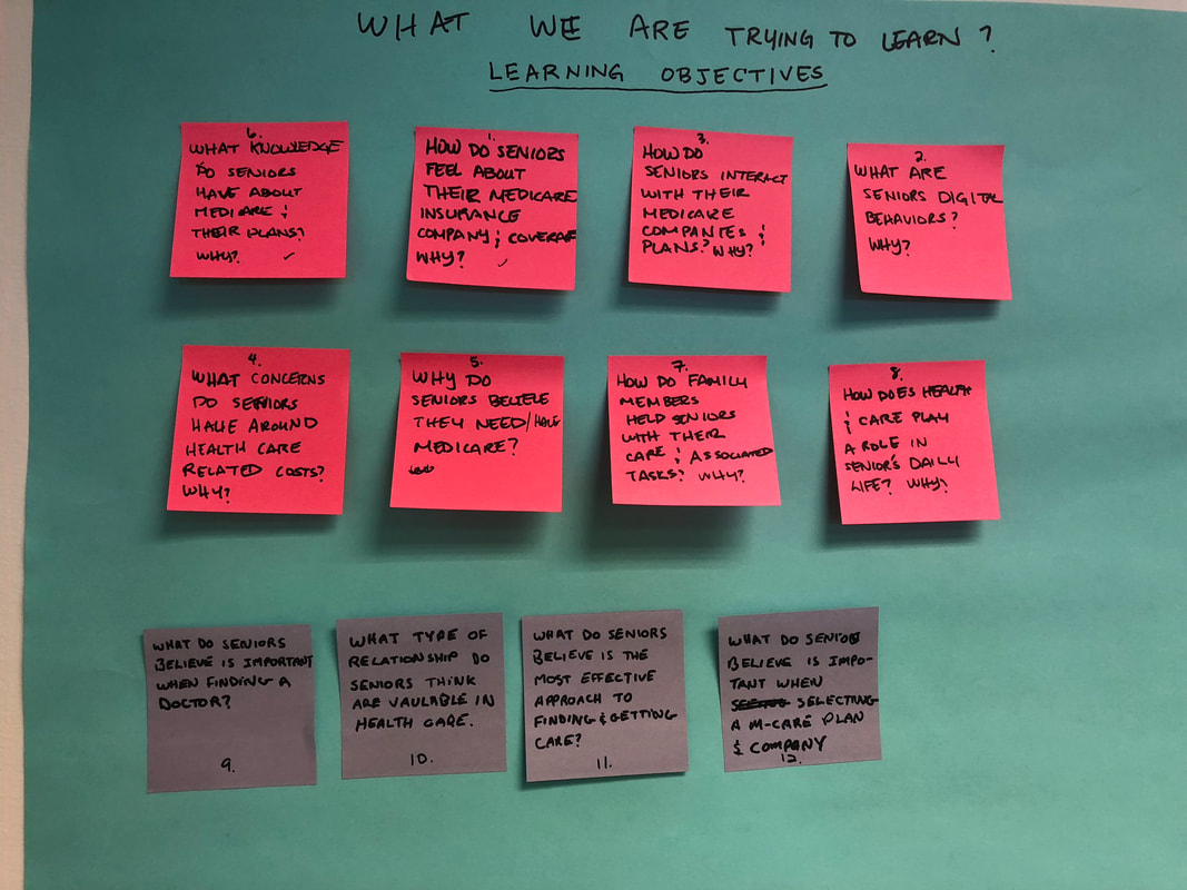
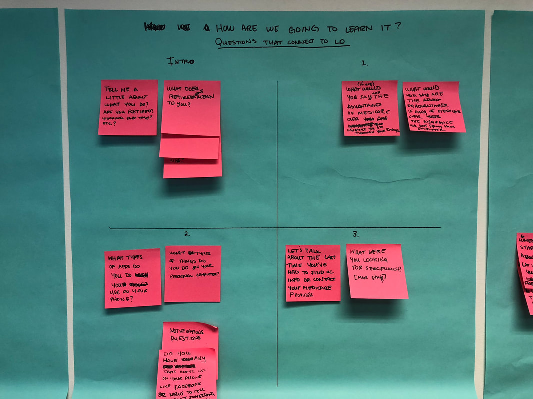
Due to the limited timeframe and the client’s hesitation to provide us member information, we conducted guerilla research. Our goal was to understand issues seniors face in terms of healthcare costs and ensuring they are healthy, in order to ensure we provide alluring value-added services. First we determined what we wanted to learn and then we decided what types of activities and questions we could ask to find that information. Because we relied on friends of families who were not in the area we settled on user interviews over the phone/skype. We talked to 10 seniors and 2 caregivers (those who take care of a senior using Medicare) and 2 brokers. We choose these types of people based on the information provided by the client. We were also able to look at some of the Medicare portals available to them to make a better assessment on what features they used, why, how they used them and where there were problems.
What We Learned
Keeping abreast of healthcare costs was one of the biggest issues seniors face along with drug adherence; however we came away with several key points.
- Online resources are preferred but must prove valuable
- Several online resources compete for attention
- Lack of trust creates additional barriers
- Care costs can be difficult to anticipate
- Drug costs tend to be especially difficult to manage
- Caregivers are emotional and busy with limited access
- Seniors are comfortable online but there are still concerns
- Using coverage books to find information is inefficient
- Surprise bills cause stress
- Cigna HealthSpring tools are inefficient for tracking drug costs
- Finding quality care is time-consuming
- Finding quality specialty care can be even more difficult
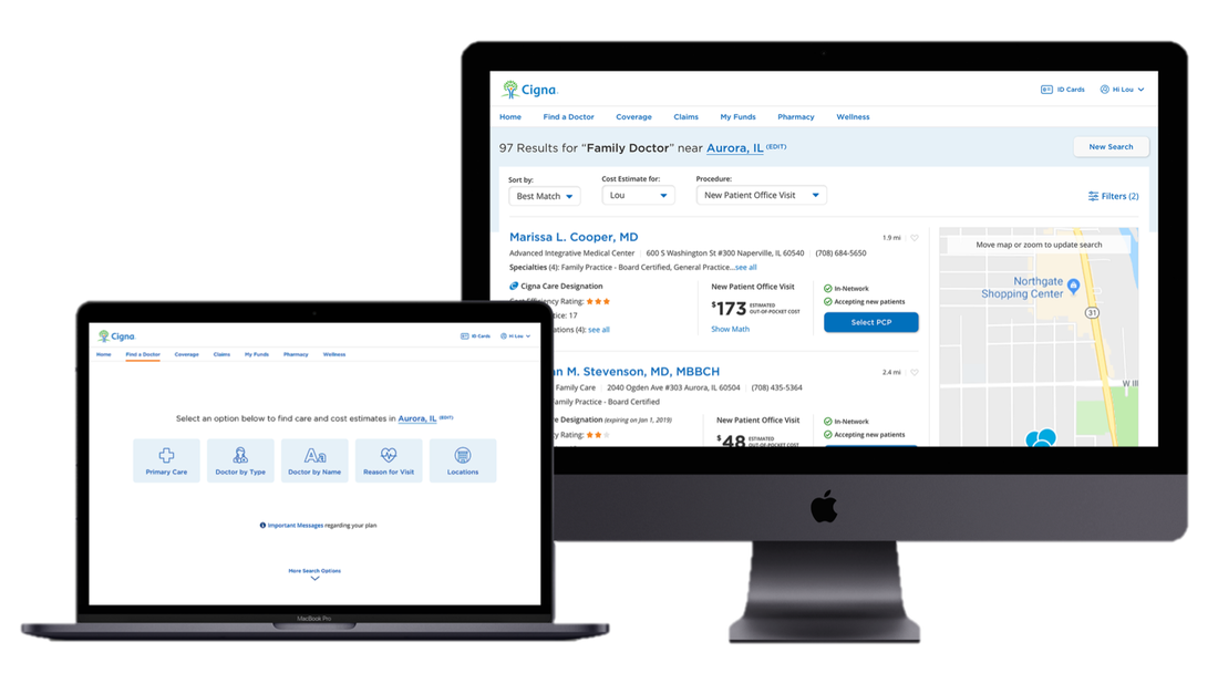
- Cigna HealthSpring tools are inefficient for finding doctors
The Vision
|
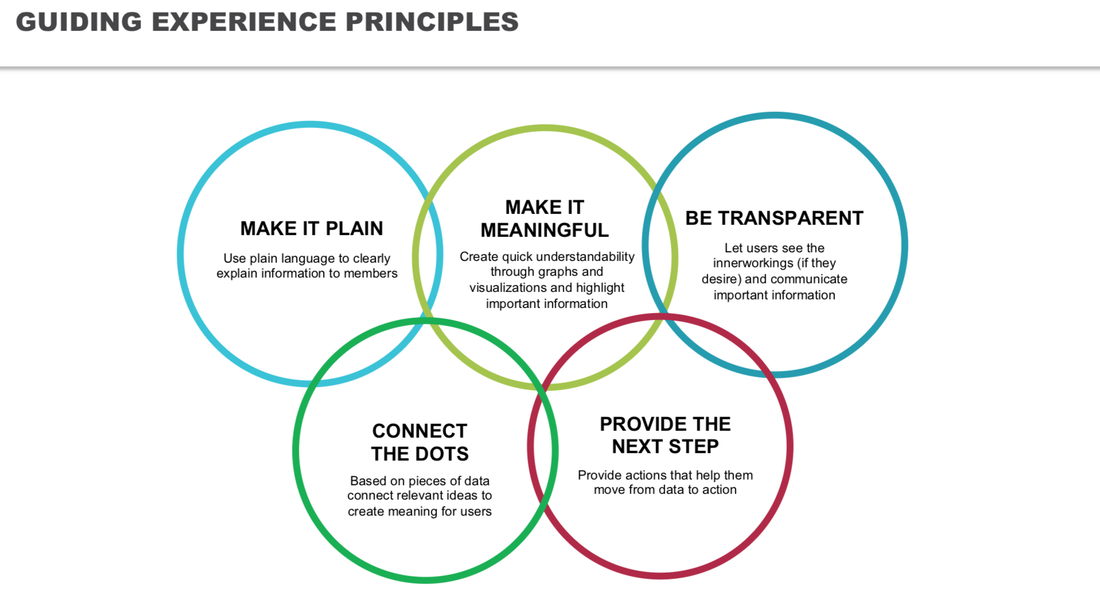
We decided to create an experience that helps users take control of costs and medications. The first step and MVP is the portal itself; however, there are other parts of the experience such as a chatbot, text messaging and other parts of service design that need to explored further. We created guiding principles to ensure that the design meets the needs of its user. We also provided a series of recommendations that will help the experience create value for its members (this is an overview without the detail):
|
Digital User Experience Design
Designing the System
|
Available components
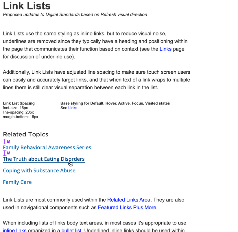
There were UI design components in place (which did not include the codebase) for other Cigna products that we utilized for this project; however, the Cigna team had not defined symbols within the sketch files and had not dictated how and when to use each component and it had not been created in Angular code within a Git repository. We created sketch libraries and worked with the FE developer to create a Git repository. We also helped the team define when components should be used and why. |
Scope of work
We created pharmacy tools, find-a-doctor searches and the dashboard as a part of the proof-of-concept.
Featured Functionality:
Medication cost tracking
Sketches to Design
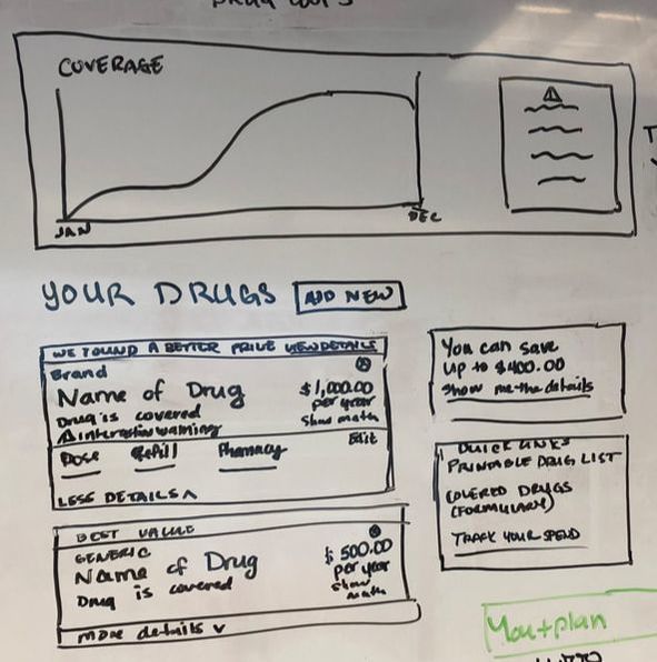
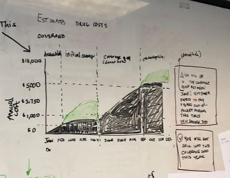
We started by creating sketches on the whiteboard as a team. We then made those sketches into prototypes using components that were modified to show the experience. We started with a quick framework; which we viewed based on best practices to see if it provided what the user needed and if it met our guiding principles.
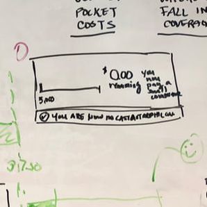
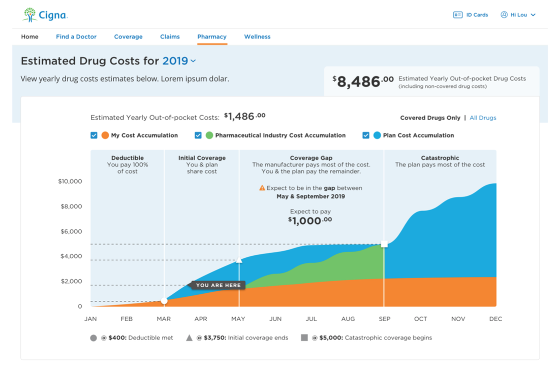
One of the biggest issues was letting people know if and when they will be in the coverage gap and what types of options they have in order to better manage their medication costs.
We played around with the visualization to help users understand what’s happening with their medication costs. We used tested the designs with older coworkers and caregivers.
We played around with the visualization to help users understand what’s happening with their medication costs. We used tested the designs with older coworkers and caregivers.
Based on the understanding that the dates were important we added more information around time. We also wanted to include the information in context and have the bare minimum information that could be added to by the user and ended up with a more contextual interactive visualization.
Currently we are in the process of selling additional work in order to finish the portal design and development over the next year.
Want More?
Don't stop now, learn about other work I've done.
|
Lashanda Hodge | Resume | Mobile: (919) 272-5661
|
