Team LeadershipI led the development of the digital experience strategy and directed the responsive design of a large enterprise retail site to increase conversion rates, online sales, revenue and customer satisfaction of the online experience. I looked for opportunities for operational efficiencies by utilizing out-of-the-box functionality, where possible, that mapped back to best practices. I as a leader of the team, I worked heavily with the client trying to understand their needs. I also set up regular meetings with my team to ensure we remained in sync. I reviewed all wireframes and designs and ensured they met the design aesthetic and accomplished the goals we set out to accomplish. I created a board that reflected the guiding principles we identified early on in the engagement to ensure we all were speaking the same language in experience design presentations. I worked closely with the designers to help them think through solutions and implications of design choices. I worked closely with developers to ensure we made the best use of the technology and made decisions for compromises.
|
Overview
|
A large international retail company partnered with us to reimagine their digital site experience and to create a flexible foundation that empowered them to drive their business while leveraging as much out-of-the-box functionality as possible.
|
Project Needs:
User Experience Design Digital Strategy Role: Experience Lead Led a team of 4 designers |
Activities:
|
The Challenge
|
To create a compelling user experience that increases revenue and reach
|
Lowe's International wanted to make it easier for their customers to find what they wanted, to help customers love where they live and to increase conversions and sales. The site was inconsistent, lacked a compelling visual design and didn't feel engaging. The site felt like a brochure site rather than an inspiring retail experience, a feeling users felt while shopping in the store.
|
The Approach
Understand the BusinessConducted stakeholder interviews and workshops to understand how users currently engaged with the brand, what their business goals were and understand their offerings and capabilities.
|
Understand the MarketsConducted regional deep research to better understand the market in various regions and to better understand the opportunities within the space.
|
Understand the UserConducted user research to understand the customer lifecycle as well as understand deeper needs of home improvement customers.
|
Understand the JourneyMapped the current journey to display touch-points, pain and emotions and identified opportunities for the organization to create brand loyalty and trust.
|
Understand the TechnologyWorked tightly with the development team to understand technical capabilities of different tools that may or may not help the business achieve their goals.
|
Understand the EcosystemIdentified and evaluated the various touchpoints within the ecosystem to better understand how an omni-channel experience needed to work.
|
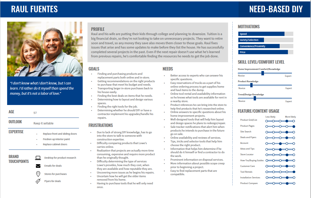
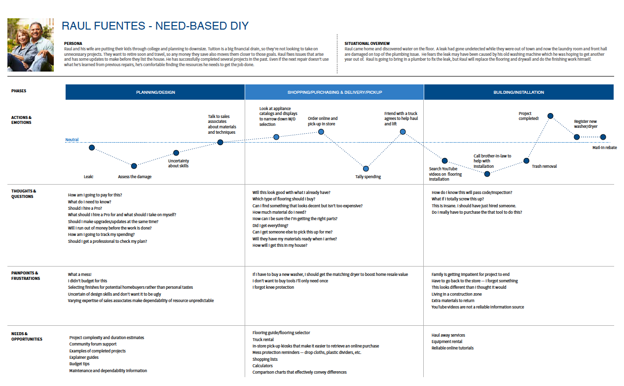
Personas and Journeys
|
We created journey maps for each persona that used the current website. We created current state journey maps to better understand the opportunities that existed. Many opportunities extended beyond the online site and moved into AR/VR and voice technologies but were not the focus of current scope of work. We are working with the client now to bring more of this functionality to life.
|
|
|
The Vision
|
After discovery we create a strategic guidepost based on user research, stakeholder interviews and market research that contained the vision, personas and journey maps. The following themes emerged:
|
|
Experience Design
Information Architecture
|
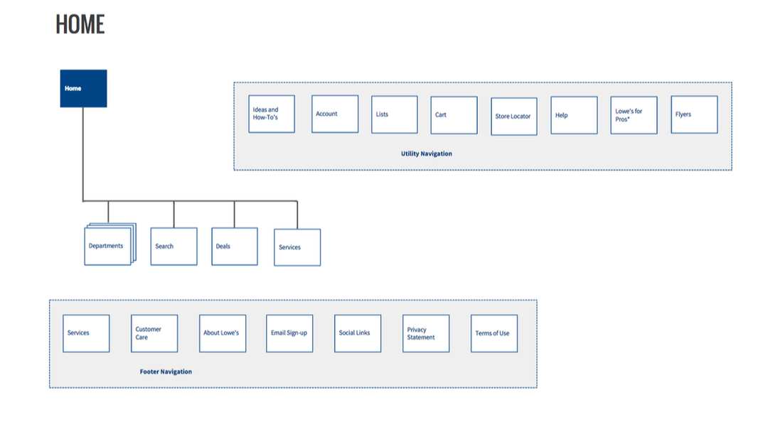
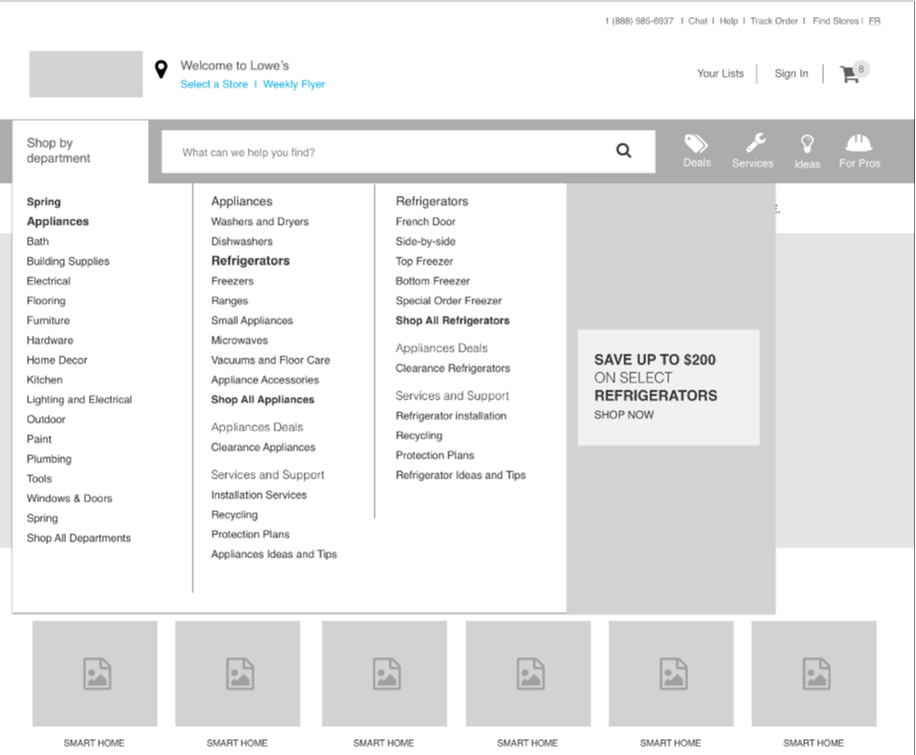
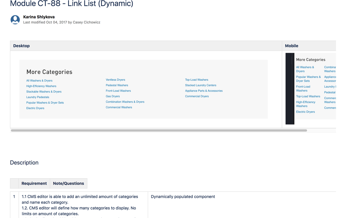
One of the issues with the previous site was the lack of structure on the site. The way the pages were grouped within the content tree were not intuitive to the user. This caused problems with the breadcrumb trail and the ease of creating a navigation for the organization. We ran several cards sorts to determine a base structure that was intuitive and then validated that structure using tree testing. We created a living sitemap (using collaborative software) that became the basis for the migration map for the content team.
|
|
Navigation
|
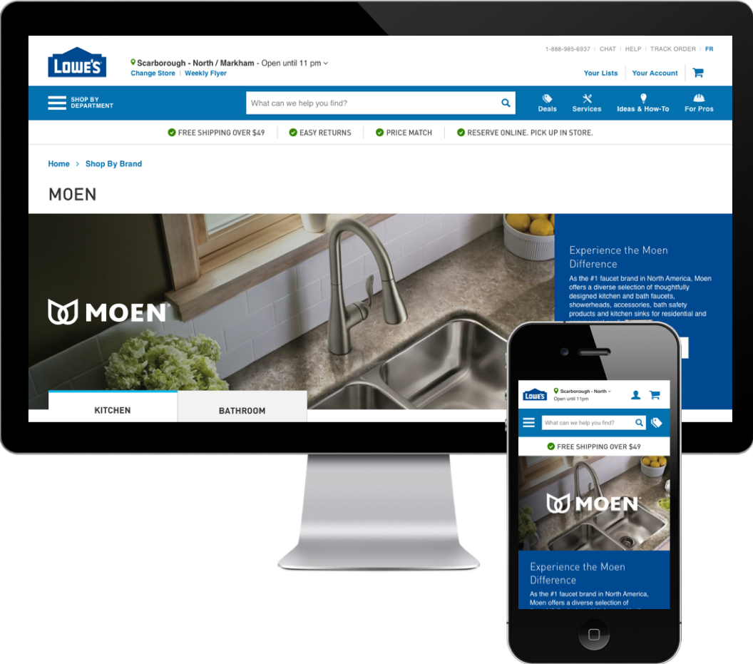
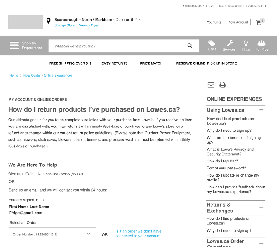
We wanted to ensure that users were able to easily see the breadth of offerings from the organization. In addition, because the markets we were serving valued coupons and promotions we also wanted to ensure we exposed that information clearly within the navigation. For the mobile experience we wanted to ensure we understand the context in which users might use the phone to ensure we made the right menu items easily accessible when using the responsive site. We also surfaced related services and content to various products within the navigation to ensure users again were provided strong cues to the various offerings of the organization. We also focused on self service to ensure users were easily able to find the solutions to their problems.
|
|
Tagging Taxonomy |
One of the biggest improvements we created was better organizing and surfacing ideas and how-to's. This type of content has been known to drive conversions because users can easily see how products can be utilized. We wanted to create a library for this content that was easily searchable and could be surfaced dynamically at the right place, at the right time, to the right person. We created a tagging taxonomy that would allow users to easily narrow down their search for ideas and how-to's. This taxonomy could also be used to drive personalization and ensure the right types of content go out for specific types of campaigns.
|
Flow Diagrams, Wireframes & Designs
|
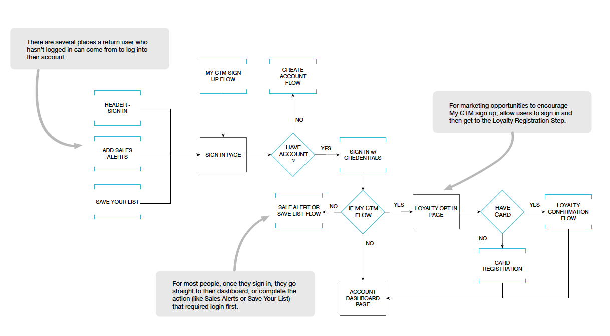
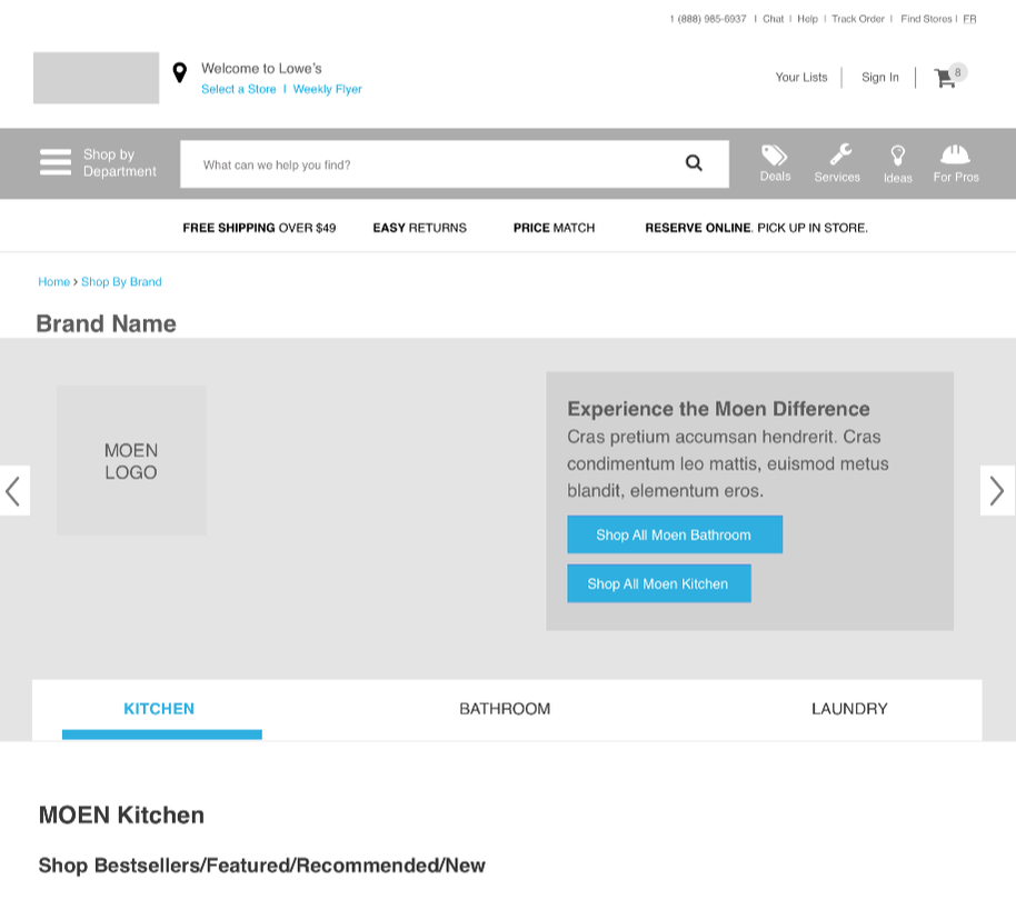
We created flow diagrams to ensure we understood the tasks users needed to complete. For each user task identified in our story maps we thought about the needs, context and motivations of the various users to ensure we created the right experience for the various user types. We also used a mobile first approach to ensure we created an experience that would work nicely regardless of the device. We wanted to provide a modular system that allowed the business to easily place content throughout the site and make it easy for components to stack as the user views the information on different view ports. Each feature was tested with users.
|
|
|
|
Design system creation
|
As we worked through features we documented each component, how it should be used and it's specs. As new features were being created based on scenarios we knew users would experience, we utilized the building blocks created and modified them as needed when they didn't quite work in a particular scenario. Each component and elements that made up those components were setup within our sketch files so team members could easily utilize components and elements, keeping the look and feel consistent and I worked to ensure each of the components and elements used made the experience feel cohesive and that the components made for an optimal experience. We captured this information in Confluence.
|
The extras
- I also created training documentation to train the client on how to use the new CMS they were provided.
- I determined which features should be worked on within each sprint.
- I worked on content strategy (mainly nomenclature) for the various CTAs and information within the customer service section.
|
Lashanda Hodge | Resume | Mobile: (919) 272-5661
|
|